|
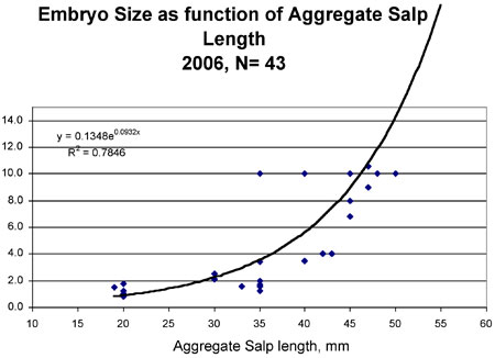
This graph shows the size of developing embryos inside female aggregations of salps, relative to the size (body length) of the aggregate. If both mothers and embryos grew at the same rate, the line would be straight, but the line curves up, which shows that the embryos grow faster. Two of the aggregates had much bigger embryos than expected and these data points are far to the left of the line. The N=43 at the top means that the number of salps measured was 43. There are two numbers on the left that represent the results of statistical analysis to tell whether the data and line are likely to be real results. The R2 number expresses how well the line “fits” the data points: 0.7846 is a pretty good fit. (Data from Larry Madin, Woods Hole Oceanographic Institution, L.M. Gould cruise, 2006.)
|
Mailing List | Feedback | Glossary | For Teachers | About Us | Contact
© 2010 Dive and Discover™. Dive and Discover™ is a registered trademark of Woods
Hole Oceanographic Institution

